Hello
My name is Vangelis Bibakis. I am a web developer turned solopreneur (solo-entrepreneur). Check out what I’m working on, what I’ve done in the past and if you want to get updates about new things I release, subscribe to my newsletter. You can also find me on Twitter or Facebook.
Latest posts
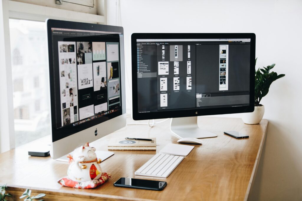
What is the ideal monitor setup for productivity?
My monitor history Like many of you I’m working with computers most of my adult life (and even before that). My first monitor was a monochrome black and white 12” CRT CGA. The computer was a Hyundai with an Intel 8088 CPU and a whopping 20MB hard drive. I believe I was the first kid at school to have a hard drive. Ever since that first computer till today, my #1 complaint was always this: The monitor and it’s resolution are too small. Eventually I went on to get a new computer with a new monitor many times until today.…
MobileTest.me is reborn
Introduction For those of you that don’t know, there is a range of tools aimed at testing responsive websites. They are called “Responsive testing tools”. By far the best looking is MobileTest.me. It’s a tool I created more than 10 years ago, long before responsive testing was possible in a browser. The idea behind this tool is very simple. You select a device. Type a website URL. And voila! You can see how your website looks on this specific device. While the majority of its users are developers who want to test the websites they are making, there are more…

10 awesome side project ideas for software engineers
If you are looking to side hustle then you need a great side project idea to build upon. Although execution and marketing/sales are far more important, a great idea gives you motivation to achieve that great execution. In this post I will share with you 12 amazing ideas you can start building right now. Website/landing page, builder for a niche There are millions of small businesses in need of a website or a landing page. Think of a small hotel for example. Most likely they take their reservations from some big player like booking.com but still, they need a small…
Introducing RandomPasswordGenerator.app
I recently created a small tool for creating secure passwords. Yes there are more tools out there but this one ticks all the boxes. Super simple to use. Password generation takes place on the client, not the server. This means no passwords travel over the network. Easy to choose your ideal settings. Remembers them across visits. Runs in all browsers, desktop and mobile. Free to use with no ads. If you need a way for your customers to create truly secure passwords this app is for you. It’s something even non technical users can easily use. Just click the red…
Why you should start a side project – and what are the first steps
Why you should start a side project. Side projects are usually small undertakings which take place outside our work hours. However many times if a side project is successful enough it can grow into a real product/business. For example Gmail, Twitter and Slack were started as side projects and grew into the huge products they are today. Learn new skills. When starting a new side project, you call the shots and decide about everything. This allows you to use the tools you get to use for your project. A side project is not big as a “real” product but it’s…
3 Months with the Apple Watch
Why Series 3 ? The Apple Watch series 3 is Apple’s affordable take on the smartwatch. I chose it over the series 5 for the sole reason that I was experimenting with this whole smartwatch thing and the price difference was quite substantial. Series 3 starts at $200 while the series 5 starts at $400. Perhaps the best feature of Series 5 is the always on screen. At the time of purchase I didn’t think that was something I needed. After using the Series 3 for 3 months I’m certain that this is a feature I need. The sole reason…